Most Mac apps have one design. Diskzy has two, and you pick in Settings.
Bento is the design I made: tiles, flat sand panels, and a personality of its own. Native Mac is the opposite. It uses Apple's own pieces, so it looks like it could have shipped with the system.
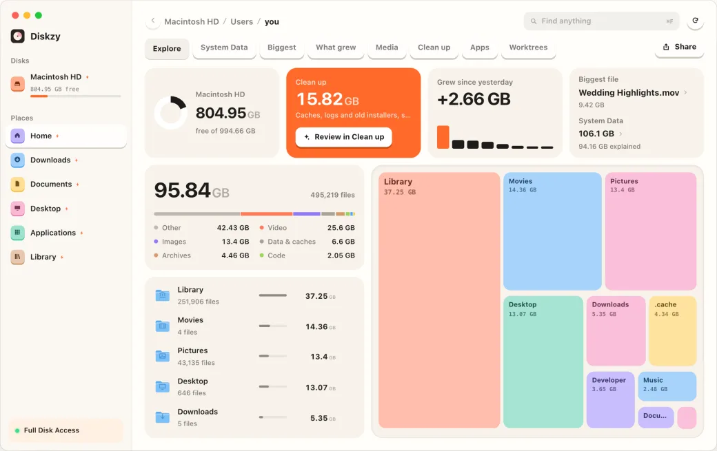
Here's a rough comparison, using the same data in each. It's an HTML sketch rather than the app, but it shows the idea.
What each one does
I shipped the two looks on October 27, and rebuilt Native Mac properly for 0.2.0 on November 1, using the system's own parts.
Then one small change gave me something I couldn't have built myself. Linking against the macOS 26 SDK meant Native Mac picked up Liquid Glass, and the system drew the edge down the sidebar.
I think that's the strongest argument for going native. When Apple changes what a Mac app looks like, your app changes with it, and you didn't do anything. Bento won't get any of that. Everything in it is mine to maintain.
What you trade
- Personality
- Screenshots people notice
- Room to explain things
- Control
- Instant familiarity
- System behaviours
- Future updates
- Trust
Diskzy makes that trade unusually interesting, because trust is the product. You're letting it delete files. An app that looks like it came with your Mac has a real advantage there. But a Bento screenshot is what gets someone to look in the first place, and a grey table doesn't travel well on X.
So I stopped trying to pick. It's a real cost, because every new feature now needs building twice. The new Worktrees tab had to work in both.
When to stop fighting the platform
Design engineers can have a bad habit here, and I include myself. We rebuild things the platform already does well, because the custom version is ours. Native lists have years of behaviour in them: keyboard handling, selection, right-click, accessibility.
My rule now is to go custom where it's what makes the product different, and use the system's parts for everything else. If nobody would ever pick your app for its dropdown menus, don't write your own dropdown menus.