A while ago, the line next to Ikiform on my site said "Build Forms, Collect Responses & Analyze." That describes every form tool ever made.
On October 17, 2026 I started a new repo. Today the homepage says something very different.
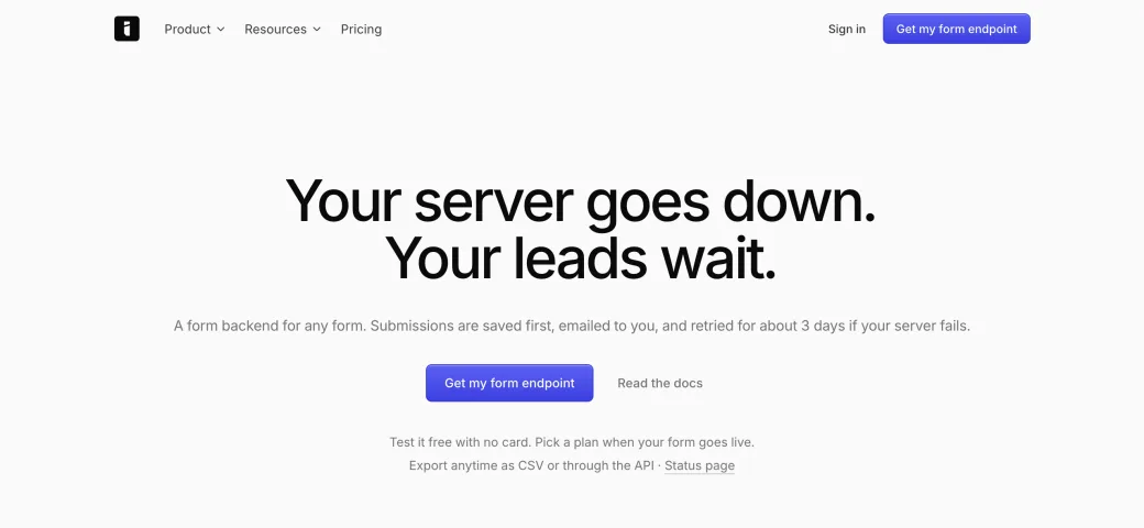
The change came down to one question. What's the worst thing a form can do?
Being ugly isn't it, and neither is missing a feature. The worst thing a form can do is lose someone's message while telling them it arrived. They think they've contacted you. You never hear about it. Neither of you ever finds out.
Save first
So there's one rule underneath the product, and every other feature has to work around it. The submission is saved before anything else gets a chance to fail.
- Saved before anything else
- Emailed to you
- Sent to your webhook
- Retried for about 3 days
Once you hold on to that rule, a lot of smaller questions answer themselves.
What if the workspace goes over its limit? Most tools would reject the submission, because that's the simple way to enforce a plan. Ikiform holds it instead. It's stored and hidden until the plan changes, because the person who filled in the form did nothing wrong.
What gets retried? Each delivery keeps the exact bytes of its first attempt, and every retry and replay sends those same bytes. A webhook signature covers the exact body, so anything rebuilt later could stop verifying, or quietly differ from what happened at the time. When you replay something, it should be the real thing.
Don't lie to the person filling it in
The most interesting decision is what to do when a form isn't paid for yet.
You can test Ikiform for free and pay when real traffic arrives. So what happens when a real visitor submits a form on a workspace with no plan?
It's a detail almost no one will see, and I'd still fight for it. A form that lies once can't be trusted again.
The owner gets one email, ever, saying a real submission arrived and is waiting. One. I'm not going to nag people about it.
The headline that got the most clicks
I had the same problem with the headline. I tested six, using 100 simulated buyers. They're AI personas and not real people, so I treat the result as a hypothesis until real traffic backs it up. It was still a useful way to think.
The clearer headline explained the product well, but it gave no one a reason to switch. The other one named the fear, the same one the whole product was built around. It did lose on clarity, so "a form backend for any form" moved into the line underneath.
I liked that this came back to the same idea as the architecture. People don't buy a form backend because they want a form backend. They buy it because they've lost a message before, and they don't want to lose another.
Start with the worst thing your product could do, and design backwards from there. You'll get a better product, and probably a better headline too.