My homepage says I work on the small details that make software feel resolved. I wrote that sentence a while ago and never explained it, so here is what I mean.
Software feels resolved when it answers your question before you finish asking it.
You click something and wonder if it worked. You open a menu and wonder where it went. You see a number and wonder if you can trust it. Each of these is a tiny open question, and a good product closes them so quickly that you never notice you asked.
The screen is the small part
A mockup shows one moment. The product has to survive all the others.
Here is a single button. Most designs show the first one, and the rest get decided later, often by whoever happens to be building it that day.
None of those states is a nice extra. A person will meet every one of them eventually, and each is a chance to leave a question open.
Timing is part of the answer
The clearest example I have is a switch in HextaUI.
You flip a setting and it has to save to a server. The obvious design shows a spinner while it saves. On a fast connection that spinner appears for a moment and vanishes, so a simple action now has a flicker in it.
So the switch flips right away, and the spinner only shows if saving takes longer than 400ms.
If it fails, it flips back. Ikiform's dashboard switches do the same: they flip right away and only revert on failure.
Nobody will ever compliment this. That's fine. They just won't have a reason to doubt the switch.
What this looks like in practice
Going back through my own changelogs, almost every detail I care about turned out to be the answer to a specific question.
| The question | The answer I shipped |
|---|---|
| Is this thing broken? | HextaUI shows a loading state behind block previews instead of a white frame. |
| Did the app freeze? | Diskzy's scan screen shows its labels at once instead of a blank screen. |
| Where did that popup go? | HextaUI's HoverCard keeps the side it first opened on instead of flipping. |
| Where am I? | Focus rings stay visible inside scrolling Tabs and Tables. |
| Can I tap this? | Small HextaUI buttons get larger touch areas without looking any different. |
| Why did you leave this one out? | Diskzy says so, right on the row. |
That last one is my favourite, so here it is.
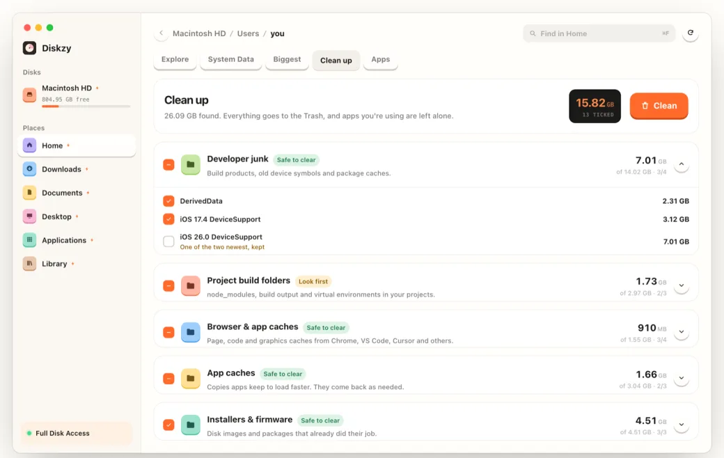
Without those five words, an unticked row in a cleanup app makes you wonder if it's a bug. With them, you know the app thought about it. It's probably the highest trust per word in the whole product.
Resolved isn't the same as polished
Polish is easy to confuse with this, because the two often use the same tools. Motion, shadows and blur can all answer a question. They can also just be there to look expensive.
I use one test now. If I removed this detail, what would the person no longer know? If the answer is nothing, it's decoration. Sometimes decoration is good, and I like it on a landing page. I just don't count it as finishing the work.
The opposite is also true. Plenty of software with no visual flair at all feels completely resolved, because it never leaves you wondering.
How to find the open questions
You can't find these by looking at a design file. You find them by using the real thing, slowly, on a bad connection, with a keyboard, with the longest name in your database.
Every time you hesitate, write down what you were wondering. That list is the work.
The goal is a product where you never have to stop and wonder, and that's what I mean by resolved.