This site has had five designs since July. I redesigned it again this month, with Claude writing nearly all of the code.
The part that surprised me was how little of my time went into making things. Almost all of it went into saying no.
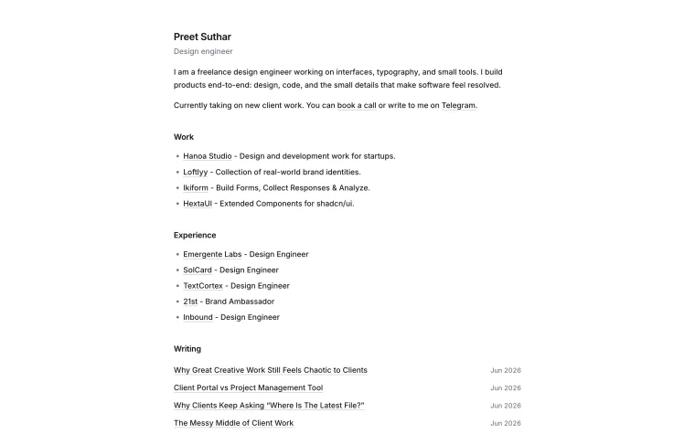 Jul 2. "OpenAI-style light theme."
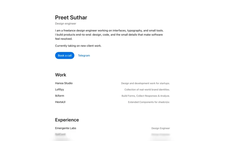 Jul 9. "Apple-style theme."
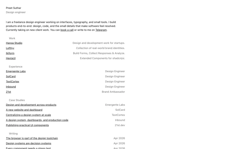 Jul 15. "Editorial layout."
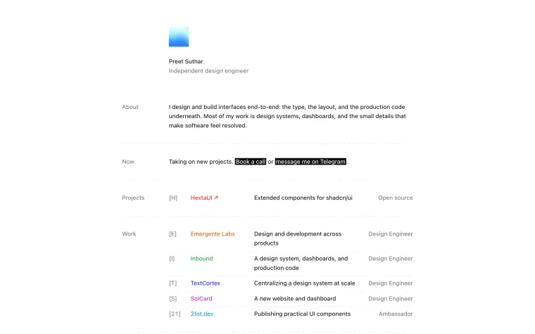 Oct 9. "Redesign."
You can read a lot in those commit messages. I was trying on other people's taste for a while there.
What I asked for
This time, my brief was the vaguest possible thing. I told it to think about how we could make the site "creative and eye catching", and added that we "don't want to be shit ton of flashy but something really cool and nowehere seen."
Then I said I wanted the site to show how obsessed I am with detail and interaction. And that's where it went wrong in an interesting way, because it did exactly what I'd said.
What got cut
Everything crossed out here was built, working, in a browser, before I rejected it.
The most useful thing I said in the whole project was a correction to that first one.
I didn't meant that.. i meant entire webste should be designed that way that the visitor automatically understands everything.
Typos and all. That sentence did more than the original brief, and I could only write it after seeing the wrong thing built. I didn't know what I wanted until I could point at something that wasn't it.
What making things cheap changes
Before, building a page transition would've cost me an afternoon, so I'd have thought hard first, or kept it because I'd paid for it. Now it costs a sentence. Which changes two things.
First, there's no sunk cost. I threw away working features without a second thought, and that's new for me. I've definitely shipped bad ideas before simply because they took a week.
Second, there's no friction left to stop a bad idea. Every suggestion is available immediately. If you can't tell a good one from a bad one, you'll end up with a site that has all of them. It'll look expensive, and it'll look like everyone else's.
So the tool made my taste matter more, which I didn't expect. I can tell you exactly which decisions on this site are mine: nearly all the ones you can't see, because they're things that aren't there.
What stayed
The homepage is now a few sentences at normal text size. It has small logos and plain links. Click a name and you go to that thing.
There's one trick left. If you find the word "underneath" in the first paragraph and hover over it, the page shows its real measurements on top of itself. I kept that because it does what the Details section was trying to do, without saying anything. It doesn't tell you I care about the details. You find out by finding it.
The fair question
Is it a bit odd for a designer to tell you an AI wrote the code for their portfolio? Maybe. I'd rather say so.
And I'd push back on the idea that this makes it less mine. The code was the part I gave away. What's on the page is seven rounds of me saying "no, not that," and I can't see how to outsource that part. If you could, you wouldn't need me.